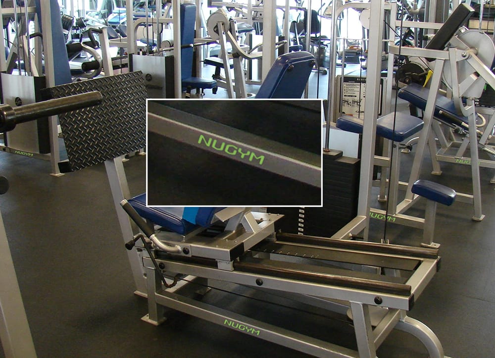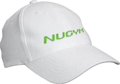
This mark was created for a remanufactured gym equipment business in Orange CA. The applications include decals for equipment frames (they wanted it to be compatible with the original manufacturer’s branding), a stationery set, advertising grids, promo items: water bottles, towels, print collateral, web site header, t-shirts and showroom signage.
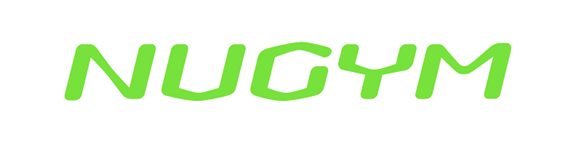
I drew these custom characters using human body parts and mechanics to get a muscular gestalt going; lots of active negative spaces, too. Color alone carries the the rest of the branding presentation. Palette is florescent green and orange, black and white. Only the type characters necessary to make the name are finished. Hey, if anyone wants the entire alphabet, I’m game. Message me, and we’ll work out a deal (no pun intended).
This business was a start-up when I worked for them. The ID materials and guidance were very well-received, and helped bring in a lot of business in the beginning, but as far as I know, the NUGYM partnership broke up only about two years later. It looks like this mark may be abandoned, but I noticed there’s a weight rack outfit from Kentucky branded “NuGym” that uses florescent green to brand their products.