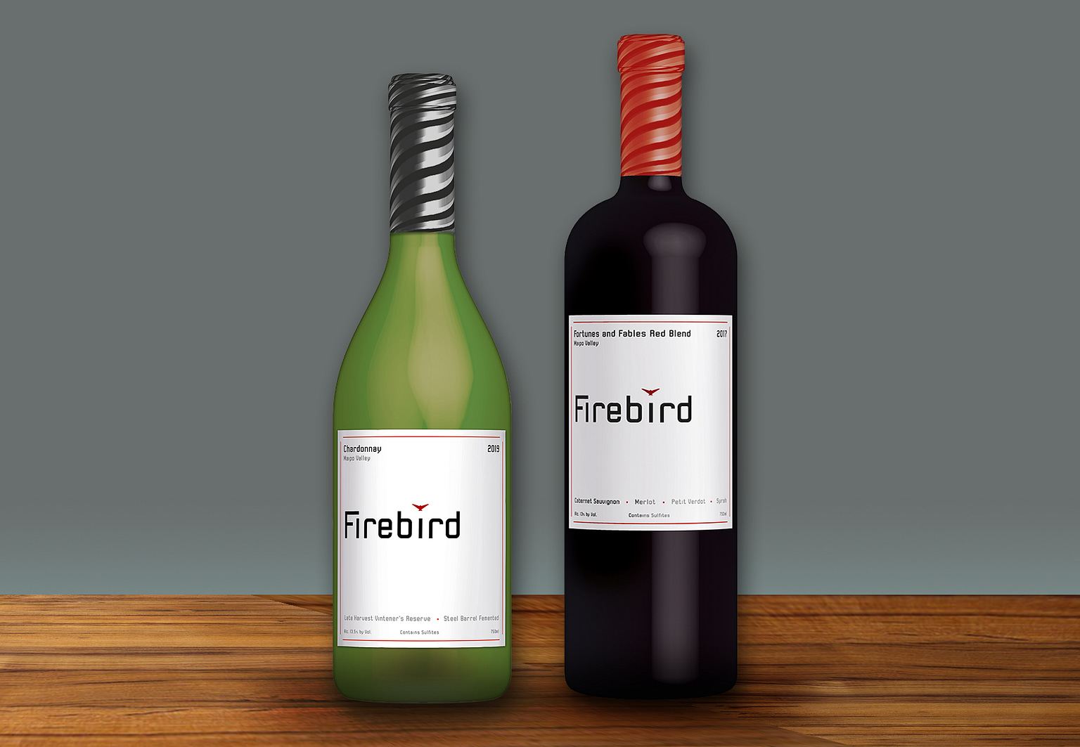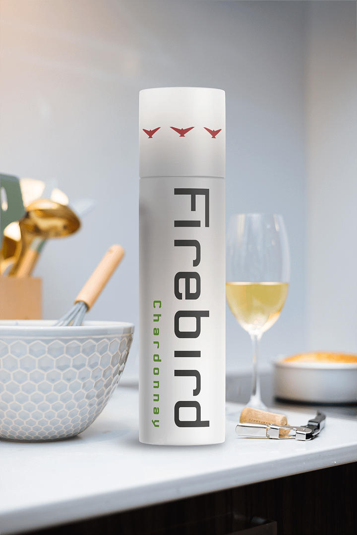
This was a packaging experiment for a mid-priced Winery. Nothing fancy, but pretty distinctive and elegant. The bird dots the “I” and the rest of the type resembles plumbing, perhaps to put out fires. You’d drink it if the price was right, wouldn’t you? To find the right mood, I harkened back to the original boutique California winery labels from the 1980s to give the product a me-too shelf presence that’s classy enough to scale up and expand easily when necessary.


